
Events are the agents of the proverbial constant change. For some types of events, the change can be almost unnoticeable, but the aggregation of those little changes can eventually lead to a tipping point of profound change. As an enterprise’s environment changes (external and internal changes), those agents of change need to be modeled into the data analytics platform. That is, without devolving into a big ball of mud.
In this blog, I’ll describe a cube modeling technique that enables the incorporation of a wide breadth of event types into OLAP cubes in a generalized, flexible, and scalable (in terms of a widening breadth of event types) manner. This offers the best of both worlds: The highly detailed model of what is of core importance to the enterprise as well as the peripheral illumination of the surrounding ecosystem.
Figure 1 illustrates the end product of this blog. Pictured is a “core domain” cube (within the white box) supplemented with generalized events of many types (the rainbow cube) from supporting domain data products. The core domain cube centers around Sales. Its mission is to enable research towards promoting profit and growth. In order to facilitate that mission, it is integrated with customer feedback and marketing campaign data.

Figure 1 – A “core domain” cube supplemented with generalized events from domain-level cubes.
However, the sales domain doesn’t operate in a vacuum. Every enterprise operates within an ecosystem of supporting domains as well as forces outside the enterprise walls. Analytical data for these supporting domains (the cubes outside the white box) are provided by domain-level data products. There could be dozens of domain-centric data products, which provide analytical support for its respective domain.
It would be nice if we could integrate all of them into one big, all-encompassing, ubiquitous data product. But that will usually result in an unmanageable, monolithic behemoth, a tangle of dependencies. It is a world where every fix results in two breaks. That is the exact opposite of the distributed, loosely-coupled world that the currently popular Data Mesh methodology intends to lead us towards.
Instead, I propose a dimensional modeling technique where we can add generalized events across all of the supporting data products into a structure I formally call the Generalized Event Ensemble, Event Ensemble, for short. It is a cube modeling technique that facilitates the ability to respond to changes in an enterprise’s environment with minimal impact on the schema of existing OLAP cubes. This is important because:
- Change is constant. We can pretend things haven’t changed and continue to abide by the myths of long-obsolete metrics. But constant change is more real than the illusions that we protect.
- So, whenever an OLAP cube’s schema changes, the cube would need to be fully processed1. The schemas of OLAP cubes are rigid – but that’s a fundamental trade-off enabling its extreme performance. Application of the Event Ensemble enables the opportunity to model in changes with incremental processing.
- The reality is that there are many more factors affecting the dynamics of an enterprise than just the data in a few major software applications. An analytics data source should be readily modifiable so newly discovered data of value can be incorporated.
This blog presupposes a little familiarity with the value of OLAP cubes and Data Mesh. My earlier blog, Data Mesh Architecture and Kyvos as the Data Product Layer provides an overview of the two concepts and how these two concepts relate.
Events
Events are at the core of analysis and strategizing. They are what drive perpetual iterations of changes to things as well as the subsequent responses to those changes. The world we desperately try to understand is a live, iterative, highly-parallel, complex churning of events triggered by prior events and spawning new events. Events are both cause and effect. They are the result of the interactions of objects. Objects without events are just a dead, static collection of things.
In terms of data, anything with a datetime is an event. That includes updates to Jira tickets, web page clicks, sales of big-ticket items, the various steps of a manufacturing process, disasters, births, deaths, crimes, hirings, firings, doctor visits, name changes, IoT device readings, new laws, the release of a new product, etc. Can you easily add 20 more? Bet you can add 50 more after that.
But events aren’t a new concept in the decades-long history of the OLAP cube world. They are our fact tables – the heart of the star/snowflake schema. Each fact table represents a type of event. Typical examples of familiar fact tables include product sales, Web page clicks, customer support calls, injuries, and package deliveries.
For any given OLAP cube, we are probably interested in more than one type of event. Most OLAP cube technologies, including Kyvos, are capable of modeling more than one fact table. For example, every prescription, diagnosis, treatment, and procedure at a hospital are event types. Each of those types of events could be a fact table modeled into one cube and linked through common dimensions such as patient, doctor, and healthcare facility.
Whatever decisions we make based on our analytical databases and tools depend upon much more than a few types of events. Imagine a hospital forecasting the number of beds, staff, and supplies for each day of the next few months. That’s a critical use case! Genuinely helpful forecasting is nearly impossible just by studying the high-level events mentioned in the previous paragraph. Those few types of events aren’t nearly enough to dig deeper into the factors contributing to the combinatorial nightmare of “black swan” events that can leave a healthcare system wide open to disastrous results.
Although today we’re used to talking about thousands of features (dimensions or attributes in the OLAP cube world) plugged into some machine learning models, we still think of modeling OLAP cubes with fact tables numbering in ranges of what is predominantly just a few to a dozen or so in extreme cases. While most cubes today consist of several dozen to hundreds of attributes2, the thought of modeling hundreds of fact tables sounds ludicrous … and it is in terms of modern OLAP technology.
Consider the sample of just a few domains of events illustrated in Figure 2 below. I’m pretty sure these events more than affect the forecasting of resources in hospitals, but I’m also sure most hospital cubes generally don’t model in these events.
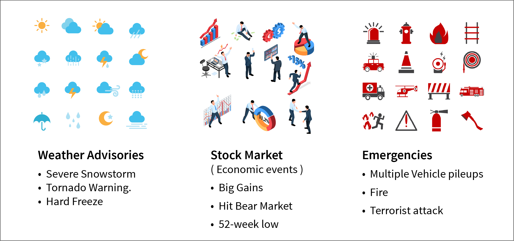
Figure 2 – A kaleidoscope of events that happen in the world.
How many additional categories of events not typically related to hospitals affect the operations of a hospital? Thousands of various environmental metrics, the emergence of new products on the market, viral media events, and disruption of supply chains, electricity, water, and transportation. Many of these types of events are facilitated through billions of IoT devices monitoring millions of types of events. All of those types of events can lead to a mix of reasons for people ending up in the hospital – often in ways we can’t imagine until it happens.
But we don’t need to look outside of an enterprise to find an already substantial plethora of event types. All large enterprises already employ dozens to hundreds of specialty software application packages. They can be built in-house or purchased, or they can even be just a function-laden and macro-filled Excel spreadsheet. We’re aware of the big ones used by very many information workers, such as ERP, CRM, and SCM. However, we’re not aware of the dozens of specialty applications used by a few specialists. Although relatively unknown to most, they still contribute towards the decisions of those specialists, which in turn affects the enterprise.
Concepts such as Data Mesh and Data Hub facilitate the ability for an enterprise to surface the information from those specialty applications to an audience beyond its respective domain.
Further, expanding audit requirements (logging all data changes), concepts such as “time travel” (viewing data as it was at some past time), and “event sourcing” (updating each piece of data as log entries as opposed to updating values) places even more attention on a widening breadth of event types.
The Event Ensemble
The Event Ensemble is implemented as an ensemble of a fact table of consolidated, abstracted events, along with several supporting dimensions. The event fact table is kind of like an aircraft carrier within an aircraft carrier group of supporting ships. There is the central player of the events and a cast of task-specific supporting dimensions.
Each dimension of the ensemble represents a primary generalized concept associated with events. The secondary details lost in the generalization of those concepts are the trade-off of using the Event Ensemble mechanism versus implementing a fact table along with their unique dimension attributes for each event type. We trade off domain depth for flexibility and a “wider field of vision”.
Events happen at a time and place to one or more things. That covers the left three dimensions shown in Figure 3 (Date, Location, and Object). Figure 3 also includes a few diverse and color-coded examples of events and how the parts are parsed into the generalized event concepts.
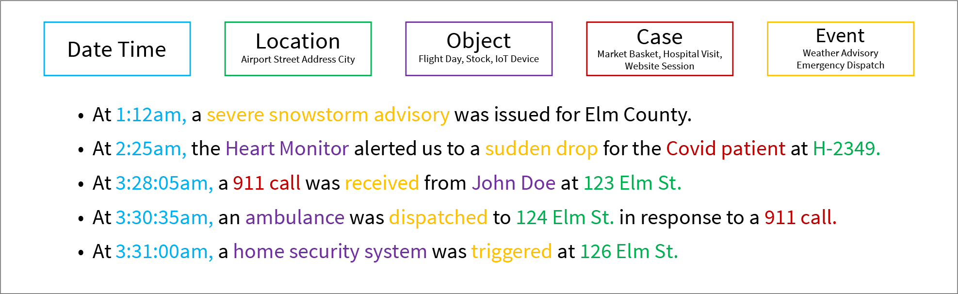
Figure 3 – The support tables of the Event Ensemble.
Following are brief descriptions of each Event Ensemble dimension:
- Date Time – Date and time of the event. I mentioned earlier that anything with a datetime is an event.
- Location – Location of the occurrence of the event. “Location” can be rather subjective. In fact, it could be “virtual”, for example, in the case of a Web page click.
- Object – The primary object involved in the event. In reality, events involve much more than one object.
- Case – A group of events somehow tied together. For example, a hospital visit is really a set of events that happen to a patient during a hospital visit. Another example is a Web session, which consists of the clicks a user makes on a particular visit to a Web site. I won’t get into this aspect now. We’ll explore this more in another blog.
- Event – A dimension of the event types.
Those abstracted concepts are the things common to all event types. There are certainly a mind-boggling number of things that are not common among event types. But the study of what is common amongst all event types can yield profound clues, from which we can subsequently drill through to specialty cubes for further exploration.
Supplementing a Core Domain Cube
Although an Event Ensemble can stand alone as its own “events cube”, greater value can be achieved by supplementing cubes built to analyze an enterprise’s core domain(s). For example, the core domains for an e-commerce enterprise are probably sales and Web page clicks. For hospitals, it would be patient visits. Such cubes probably integrate fact tables of sales and Web page clicks, but it would probably also include supporting facts around marketing (campaigns, AdSense, GTM, etc.), perhaps even customer support and shipping events.
Before continuing, let’s first look at a couple of examples of traditional visualizations from OLAP cubes. Figure 4a demonstrates a typical visualization from a typical domain-oriented OLAP cube. We’re viewing multiple metrics related to flight delays between airports.

Figure 4a – Typical analysis for a core domain comparing multiple measures.
Figure 4b is another example of a usual visualization from a domain-oriented cube. This time the informative visualization is from a more typical sales-oriented cube. Again, we can slice and dice by a number of attributes and/or metrics of a particular type of event. In this case, sales of liquor items by store and class.
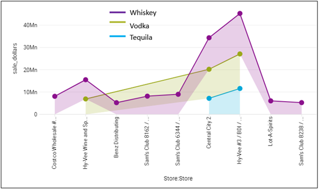
Figure 4b – A typical visualization of a more common sales-oriented OLAP cube.
The domain-oriented cubes that source the visualizations shown in Figures 4a and 4b include many attributes relevant to the domain. For example, the sales cube from which I generated Figure 4b includes a total of about twenty attributes across product, vendor, customer, store, and date dimensions.
The plurality of analytics is still performed in a “traditional” Business Intelligence manner by very many managers and analysts accessing highly-curated data using sophisticated visualization tools such as Tableau. While data scientists and A.I. folks get most of the glory today, most information workers still rely on the simplicity and friendliness of highly-curated cubes and data marts. This means, most folks are not data scientists fluent with Python and machine learning techniques, or data engineers who are able to procure and wrangle data themselves.
For these “non-technical” information workers, data engineers could continue to incorporate more and more into their cube. But how much can we add to a core-domain cube in order to glean the widest, most semantically complete view possible without it growing into an unmanageable mess? A solution is to unpivot (transform many “columns” into many rows) that wide and growing variety to a single fact table in an abstracted manner. That, is model abstract event types from across a wide breadth of sources as a supplementary Event Ensemble.
While we can browse the Event Ensemble in a “conventional” way, such as illustrated in Figure 5a below, the availability of a wide breadth of event types offers much more profound analytic promise than traditional BI visualizations.
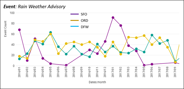
Figure 5a – A conventional way to browse Event data. Count of Rain Weather Advisories by Month.
The Event Ensemble goes well beyond simply counting the number of events from a wide range of event types. The potent utilization is to find correlations between different types of events. Figure 5b below shows how we can compare events from two completely different sources.
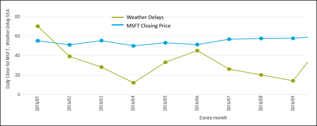
Figure 5b – Compare MSFT closing price and count of weather delays by month.
Figure 5c below is an example of how the supplemented event measures, Daily Close for MSFT and Severe Weather Advisory, can enrich reports that would otherwise include only core-domain measures. The idea of this visualization is to notice if flight delays and severe weather in Seattle might affect the price of MSFT.

Figure 5c – Combination of core-domain measures with supplemental event measures.
Does severe weather at Seatac affect the price of MSFT stock? Probably not, but perhaps an extended period of bad weather might result in missed quarterly earnings. This example is something we would normally dismiss as ludicrous. But how many ludicrous things turned out to be the answer to a puzzling problem?
The ability to easily integrate data from a wide breadth of sources to at least perform basic comparisons is highly conducive to wrangling a vision of our surroundings. Think of this as how with a flashlight, we can shine the intense beam on a small area illuminating it with much detail. But surrounding that intense beam is a much wider, but diffusely illuminated area. That less intensely illuminated area may not light up as much detail as the beam, but it’s enough to reveal a larger context of what’s in front of us – the bigger picture.
Which is more important? The high-def detail of our focus or the surrounding area provides a wider context. My opinion is that both are equally important. Sometimes we need to focus and sometimes we need to see the big picture.
Why is Kyvos Uniquely Suited for This?
Kyvos’ core competency is the highly-performant, on-the-fly delivery of aggregated sums from massive numbers of rows of data across permutations of high-dimensional space. Further, Kyvos takes on the very tedious job of managing what could be thousands of aggregations which facilitates that performance. Additive values (the predominant computation in real-world analytics) from potentially trillions of rows are delivered to analysts magnitudes faster than databases that don’t facilitate this capability to the extent of Kyvos.
Those capabilities come in particularly handy when we’re considering the merging of what could be potentially thousands of event types each with potentially billions of rows (some with millions, some with trillions).
While some event types are relatively rare (ex. 7+ magnitude Earthquakes), the count of many event types can rise to billions or trillions. Traditional examples of the latter include sale events across a large retail system and Web site page clicks. A growing source set to dwarf those examples would be IoT-sourced events such as the multiple sensors hooked up to a patient or thousands of sensors scattered across a toxic waste site.
Event Correlation
Following are two examples of very compelling ways to harness the immense value stored within the highly-performant OLAP cubes supplemented with the versatile Event Ensemble. The Pearson and Bayes analytics I will demonstrate below are primarily about counting events. However, these queries involve the integration of a wide and diverse breadth of sources.
The examples I provide within this section are from a demo cube I modeled from free sources:
- A record of flight delays. This is the source for the core-domain cube.
- Weather advisories provided to U.S. airports.
- Daily history of stock market quotes.
All three of these completely independent data sources can be joined by dates, the universally common dimension. Additionally, the Flight Delay and Weather sources can be joined through airports. Figure 6 shows the events derived from the three sources.
Figure 6 – Generalized events from three very different sources.
The events for Flight Delays and Weather are taken directly from the respective sources. For example, the Flight Delay data has one row per issued flight delay (at the airport, flight number, date/time, and carrier level). However, the event types for stock quotes are derived from the raw, historic stock quotes – more on that in the following section.
It’s easy to see that combining flight delay events with weather advisory events would yield valuable insights. But with a cursory glance, it might be hard to figure out how the stock market data would be relevant to flight delays. There may not be obvious relationships, but that doesn’t mean there aren’t any. As unlikely as it might be, we don’t know. As differently stated earlier, how many times have we been surprised as to how seemingly unrelated events result in something significant, perhaps even positively game-changing or catastrophic?
Allowing our minds to brainstorm beyond pragmatism, it shouldn’t be too hard to see there are many plausible ways that stock market prices can indirectly affect flight delays. We could start by acknowledging that air travel is dependent on the state of the economy, the quality of goods and services ebbs and flows along with the economy, and so might the number of available flights.
The big idea of the Event Ensemble mechanism is to include a wide breadth of event types so that we may find the chain of events from one condition to another. We recently learned that health issues, such as a worldwide pandemic, can have a big effect on flight delays.
Invention of Events
The basis for much of our human intelligence is that we notice different types of events. Further, we notice what event types happen together. “What fires together, wires together”, as the neurologists and A.I. folks like to say. We also notice when some event precedes another event.
If we notice either of those patterns before others, we have a strategic advantage, at least until others figure it out or the agents involved with the pattern alter their behaviors. Think about Texas Holdem Poker. Once all the players have mastered the optimal way to play, the advantage goes to those who take advantage of new information. They discover and/or invent clues that no one else yet sees.
Back to Figure 6 above. Unlike the events for flight delays and weather advisories (which is essentially a row per event), I needed to write code to compute the events for stock prices. I took raw stock quotes and computed days with a 3% change in closing price and 52-week high and low. Those computations were fairly simple, but it is still another ETL step.
But think about the flight delays and weather advisories. Some entity (a person, panel of people, a vast organization, and/or A.I.) somehow decided to trigger those events. In a sense, we are fortunate that the substantial “ETL” was done by the nice folks presumably at the FAA and National Weather Service, respectively, and provided as a tidy csv file.
The notion of various event types requires that some intelligence notices it as something with analytical value. Some events are obviously impactful such as a big meteor literally impacting off in the distance. Or events such as a weather advisory are spoon-fed to us by someone else. But the most valuable are the novel ones we creatively notice, from which we could devise competitive strategies.
For example, a stock’s close quote changing by a significant amount (+-3% or more from the previous day) is an event indicating something potentially interesting. If say, INTC suddenly rose by 10% on some day, something related to the semiconductor industry is going on. How many other event types from the stock data could I create? There is certainly no shortage of them amongst the inventiveness of all those traders out there.
Another example might be a supermarket chain classifying a store’s sales daily performance as “Big Day”, “Average”, and “Slow Day”. These events could be correlated with other event types towards a wider understanding of what could drive good and bad sales days. Note that the performance of the computation of the events in this example could be immensely accelerated if sourced from a Kyvos cube. In this case, the sales for each store for each day could be an aggregated value condensed from hundreds to thousands of sales items through the day.
Pearson Correlation Grid
One such compelling analytic technique is to view a grid of correlations between events. I developed this idea over a decade ago but instead built upon the old “all but officially deprecated” SQL Server Analysis Services Multi-Dimensional (SSAS MD). I describe this idea in my blog on Map Rock.
Figure 7 below is a crosstab of Pearson Correlations values – flight delay types and weather delays at O’Hare during 2016.
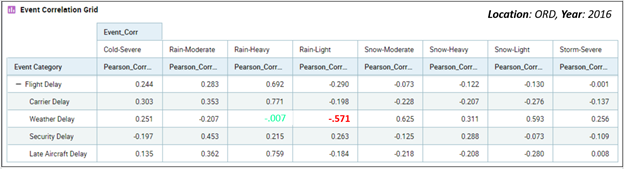
Figure 7 – Correlation between flight delay types and weather advisories during 2016 at Chicago O’Hare.
Note the value of -.571 highlighted in red. In Figure 8a, we see two time series that go into that calculation. We can “kinda sorta” see that when one line goes up, the other goes down, and vice-versa. That’s an inverse correlation.
What we’ve done with the correlation grid is to reduce the information in the line graph we would traditionally view (Figure 8a below) into a single number. Figure 7 above translates many such line graphs into a succinct grid of correlations. I call this “casting a wide net3”.

Figure 8a – The details underlying the -.571 correlation between weather delays and light rain.
Figure 8b shows validation of the Pearson correlation calculation by comparing it to the value calculated by Excel’s PEARSON function. The left shows a cross-tab view of the line graph shown in Figure 8a. I exported it to Excel and created a calculation with Excel’s PEARSON function. The values match.
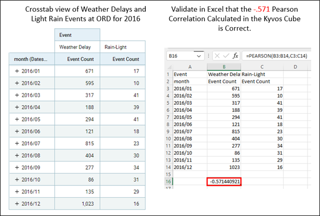
Figure 8b – Validation of the Pearson Calculation from the Kyvos cube.
Of course, the Pearson Correlation Grid (and Bayesian Grid described soon) offers correlations, not causations. However, if any interesting correlations do pop up, we can validate their significance by drilling down into a view plotting the two time series (weather delays and light rain advisories across 2016) used to compute that value. That is demonstrated in Figure 8a above.
The reason I bring up the obligatory “correlation doesn’t imply causation” thing is because there is much value in at least noticing there could be a link between diverse phenomena. The understanding of causations begins with noticing correlations. These correlations hint at the possibility of relationships we didn’t know we didn’t know.
Once we notice an interesting correlation, we can drill down to investigate the details. We could identify confounding variables or data problems (ex. too many missing values) that decrements the value of the correlation. If we never even notice the correlation, there is much less of a chance for the discovery of a previously hidden opportunity or preventing a disaster.
Bayesian Grid
Another method for “casting a wide net” in search of insightful correlations is through this grid of Bayesian probabilities in the “probability of A given B” manner.
Figure 9 shows such a grid. The columns are “event B” and the rows are “event A”. The cell highlighted in red reads: Given that there is a weather advisory for light snow at O’Hare, what is the probability of a weather delay? The red highlighted cell indicates the probability is fairly high at 0.857.
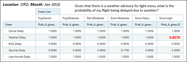
Figure 9 – Grid of Bayesian Probabilities – P(A|B).
Figure 10 below shows how we can check the figure by drilling down into the details of the probability. We first count the number of days that a light snow advisory was issued (14 days during Jan 2016). Out of those 14 days (given light snow that day), we see that a weather delay was issued on 12 of those days (85.7% of the days).
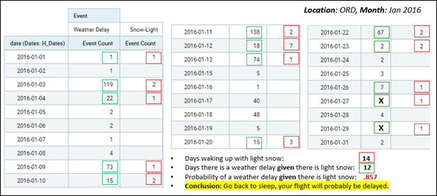
Figure 10 – Drill down on light snow and weather delays.
I should note that while 0.857 is a pretty good probability, other, more severe weather advisories do offer a probability of 1 (within the highly-specific context of January 2016 at ORD). However, a 0.857 probability of a weather delay is still good enough to ease the stress of running a bit late on a travel day.
Implementation
This section provides an overview of how I implemented the Event Ensemble. This is not a comprehensive description of the implementation. That’s another blog, tutorial video, or Teams meeting. For this blog, I intend to provide just the gist of the implementation.
The Event Ensemble Schema
Figure 11 illustrates a star schema for the Event Ensemble I modeled for the Flight Delay cube I’ve used throughout this blog. For the most part, I believe this is as generalized as it can practically be.
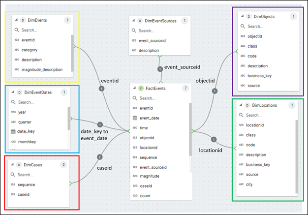
Figure 11 – Event Ensemble Schema. Color-coded to tie in with Figure 12 below as well as Figure 3 above.
As I mentioned, events generally take place sometime, somewhere, and involve one or more things. The corresponding dimensions are respectively DimEventDates, DimLocations, and DimObjects. The dimension tables are also color-coded in the same way as Figure 3.
Figure 12 below illustrates examples of how events of various types are parsed into “time, place, and thing” and written out to their respective dimensions.
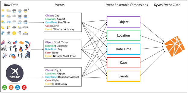
Figure 12 – How events from diverse sources are broken down into generalized parts.
The ETL for a given event type should be relatively straightforward once the event type is defined and/or can be computed (as I discussed in the Invention of Events section above). In the context of ETL, Figure 12 dictates that for new event types:
- The primary objects (ex. patients, doctors, flights, stock ticker symbol) of the new event types should be added to the DimObjects dimension.
- The locations where events of the given type can happen should be added to the DimLocations dimension.
- The new Event Type should be added to the DimEvents dimension.
- The events of the new event types are added to the generalized events table (FactEvents).
- The events cube is incrementally processed.
Figure 13 below is the data for the event types dimension (DimEvents) I compiled from the three sources (flight delay, weather advisories, and the event types I created based on stock quotes).
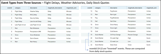
Figure 13 – The Event Types of the DimEvents table.
The Combined Schema
Figure 14 below is the combined schema of the core domain flight delay objects (red) supplemented with the event ensemble objects (green). The DimEventDates dimension (yellow) belongs to both the core domain and the Event Ensemble. As we saw with the Pearson and Bayes discussion, the date is the most primary link between the two.
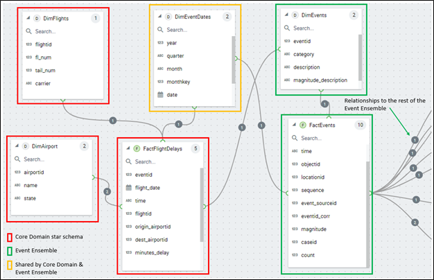
Figure 14 – Combined schema of the Flight Delay star schema and the supplemental Event Ensemble (only partially shown).
Things to note about Figure 14:
- There is an implied DimEventTime dimension not shown in Figure 14. The DimEventDates dimension should be self-explanatory. However, a majority of cubes built a decade or so ago are modeled just to the date granularity. Back then, analysis by day was sufficient for most business scenarios, and reasonably-priced hardware limited depth of granularity. But because the sequence of events is highly relevant in light of the topic of this implementation, granularity down to the second or even millisecond is imperative.
- Objects and Locations could be somewhat redundant between the core domain and the Event Ensemble. For example, the Flights Delay cube I use in this blog has the concept of an airport (FactFlightDelays.origin_airport and FactFlightDelays.dest_airport). But the airports are also members of the DimObjects dimension as “generalized” objects – along with other generalized objects such as stock ticker symbols.
Multiple Objects for an Event
In reality, events are associated with multiple objects, sometimes many objects. For example, Figure 15 shows an example of a very familiar sale event involving up to three primary objects.
There are a few ways to address this problem. One way is to denormalize the DimObjects table a bit. Backing down from an ideal isn’t so bad. For relational schemas, we strive for the ideal 3NF, but in practice often need to denormalize for various performance reasons.
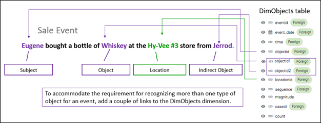
Figure 15 – It could be that events require association with more than one object.
I gave the new objectid keys (objectid1 and objectid2) generic names because other events types that require more than one object might be of a different type. I could have named the three objectid keys customerid, itemid, and salespersonid, but removing the abstraction of the names could cause confusion for other event types.
A typical sales cube would involve many more related objects than just Customer, Item, and SalesPerson. There could be objects such as payment type, shipping address, and perhaps marketing info. Such objects have analytical value, but the idea is the trading depth of event details for analytics across a wide breadth of generalized events. For this abstract Event Ensemble example, we’ve limited the objects to the two or three most important.
Location doesn’t suffer from this problem as much since events generally happen in one place. However, events can be made up of more than one event, each happening at a different place. For example, a server going down in Denver could be caused by a denial of service attack originating from a server in Seattle.
We may originally see this as two separate events. But after seeing this happen a few times, those two events happening together could be considered one event. However, this scenario opens up a big can of worms since the DoS example could involve very many locations.
Alternatively, for both multiple objects and multiple locations, we could combine the objects into a unique set and the locations into a unique set. This is similar to “market baskets”. For example, the tuple of Eugene, Whiskey, and Jerrod as shown in Figure 15 above could be hashed into a single object.
Lastly, looking back at Figure 11, note the category column of the DimEvents table and the class column of the DimObjects table. The two columns are a level of grouping events and objects, respectively. In this simple implementation, the values correspond to the source related to the events and objects. For example, the “Snow-Light” event is a “Weather Advisory” and the “airport” class is the object to which the weather advisory applies.
As with the number of locations and objects, there could be a need for more than one level of grouping for event types and objects. The approach would be similar to what has just been described in this topic.
The Measures
The primary measure for the Event Ensemble is the count of rows – each row of the FactEvents table should be a single event. In an OLAP cube, this is a straight, additive measure.
As we saw in the Pearson Correlation Grid and Bayesian Grid topics, very interesting insights can be gleaned by simply counting events across a diverse breadth of event types. However, those correlations require some fancy calculated measures. But they are based on sums of the event counts, so they are right up the alley for OLAP cubes as far as complicated, on-the-fly calculations go.
The Pearson Correlation and Bayesian Network demonstrated in the Event Correlation section are implemented into the cube as a set of calculated measures. I’ve implemented this Pearson capability in a way similar to what I describe in this very old blog of mine, Find and Measure Relationships in Your OLAP Cubes.
Figure 16 shows a sampling of some of these calculations in MDX.
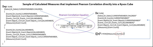
Figure 16 – Sample of the MDX implemented to compute the Pearson correlation within the Kyvos cube.
I’ve only shown some of the calculations since the other terms are too messy for an article intended as an introduction to a concept. But what is very noticeable are all the Σ symbols, implying what I mentioned about being able to take advantage of Kyvos’ core competency, the aggregation, and management of additive measures.
Beyond the count, I’ve included one measure for each event type. Looking back at the event types listed in Figure 13, there are two columns; magnitude_description and magnitude_uom (unit of measure). This describes a selected measure we can include with the event. For example, for weather advisories, I those precipitation in inches. For stock quotes, it’s obviously the stock price. We saw this stock price show up way back in Figure 5c. The value is stored in the FactEvents.magnitude column (Figure 14).
The idea of the one measure is similar to that of one object and one location discussed just a moment before under the topic, Multiple Objects per Event. Should there be a pressing need for one or two more measures, we could add one or two magnitude columns (ex. FactEvents.magnitude1 and FactEvents.magnitude2)4.
Conclusion
The “Variety” aspect of the original “three Vs of Big Data” (volume, velocity, variety) has taken center stage. Volume and Velocity are mostly fairly-solved problems for the vast majority of today’s use cases. We can readily add up billions of rows and store terabytes of data in a matter of seconds. So now we can focus on looking outside the confines of what we already know.
Implementing the Event Ensemble facilitates the ability to model a very wide breadth of event types (fact tables) into highly-performant OLAP cubes.
This blog merely introduces the concept of analysis of the relationships within a wide breadth of event types. It is the first of a trilogy targeted at the utilization of OLAP cubes beyond its traditional role as a highly-performant data source for business intelligence visualizations.
Part 2 will be a blog on a Python library named KyPy that I’ve developed. It encapsulates core OLAP use cases as well as compelling ways to unlock the analytical potential packed into Kyvos Smart OLAP™.
Part 3 of the trilogy is a high-level, Kyvos-specific introduction to something I call the Insight Space Graph. It is about what comes after Data Mesh.
Following this trilogy, I will expand upon and dive deeper into the implementation of such notions with a series of blogs. Beyond the Pearson Correlation Grid and the Bayesian Grid I demonstrated in this introduction to the Event Ensemble, there will be deep-dive blogs on other such techniques including Markov Blankets and other Bayesian-inspired structures.
Notes:
- Although it may take hours to fully process a large cube and costs from the source data vendors can accrue due to massive reads, if the Kyvos cube was already processed, it’s still online during the re-process. However, several hours to process isn’t so bad on a quarterly or even monthly basis, but it can result in much compute time and cost reading the source data on a more frequent basis.
- The number of labels we can apply to objects is growing. Gone are the days of merely gender, education level, and age group. Now we have thousands of labels available for analysis. These labels are dimension attributes. It’s not so uncommon to see OLAP cubes with attributes numbering in the hundreds these days. This is the other side of the coin of a growing number of event types. I’ve addressed the growing number of attributes with a similar technique I call “Property Bag”.
- Be wary of casting too wide of a net. If the number of event types is very high, as it would be for a very large and complicated enterprise (ex. a large military organization), that query would result in the on-the-fly computation of a grid of a few million cells. That would be very intense.
- There is a reason I don’t discuss denormalizing the FactEvents table so that we can have one row per measure, object, or location related to an event. It is it becomes difficult to count each event if an “event” is comprised of many rows. Additive counting (a major part of Kyvos’ core competency) of events is the main idea.