
Introduction
Introduced by Robert Kaplan and David Norton in the early 2000s, strategy maps, a derivative of the widely implemented Balanced Scorecard methodology, are usually overlooked in the business landscape. The balanced scorecard, with its simple, long-standing technical feasibility, provides a systematic way to measure performance against strategic goals. In contrast, strategy maps, which are more complex, visualize the relationships and progression between objectives toward these goals.
When it was initially introduced, the implementation of strategy maps faced challenges due to technological limitations and a lack of traction in the somewhat early adopter stage of performance management. The notion couldn’t take off and mostly faded into oblivion, along with other failed ideas. Today, the resurgence of knowledge graphs, semantic networks and (hopefully someday) even my Insight Space Graph, serve to remind us of the graph-like strategy map of performance management.
Much has changed since the 2000s! The proposition of this article is that strategy maps should be revisited, driven by the maturity of graph database and visualization technology, data science, machine learning and AI. This article aims to reintroduce the concept of these maps, contrast their potential implementation feasibility today versus its introduction in 2004 and their overlooked value when I wrote Bridging Predictive Analytics and Performance Management, circa 2010.
Strategy Map Background
Before diving deeper into the revived relevance of strategy maps, it’s essential to understand their roots. As mentioned before, these maps are an offshoot of the Balanced Scorecard methodology, a strategic planning and management system that aligns business activities with the vision and strategy of the organization. The balanced scorecard was introduced in the early 1990s by Kaplan and Norton to offer a balanced view of an organization’s performance. However, while the scorecard efficiently tracked performance against strategic goals, there was a need to visualize the interconnection between these objectives— enter strategy maps.
Their 2004 book, “Strategy Maps: Converting Intangible Assets into Tangible Outcomes”, set the groundwork for this concept. The book demonstrated how the creation of a visual graph, known as a strategy map, could significantly enhance understanding and communication within an organization. A strategy map is a graph that visually lays out strategic objectives, typically categorized into four perspectives—financial, customer, internal process, and learning and growth. This graph is unique as it illustrates the cause-and-effect relationships among these objectives, offering a clear representation of the organization’s strategy and its interconnected elements.
The figure below is a sample of a typical business intelligence dashboard with an embedded strategy map in the bottom-right corner. Generally, if a dashboard does include such a map, it’s typically a static, manually maintained, snapshot authored in PowerPoint. At best, the KPIs might be color-coded (typically red-yellow-green) to match the KPI status value. Contrast that to a live strategy map where updated information about the relationships between the KPI nodes—for example, information about the reasoning behind these relationships, troubleshooting tips and a metric I call the Effect Correlation Score (discussed later)—could be accessed and explored.
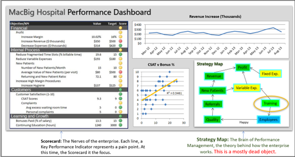
Figure 1 – A typical dashboard of a Balanced Scorecard, a few data visualizations and a strategy map illustrating how the KPIs of the scorecard relate to each other.
The next figure is a closer look at a strategy map, again, a static snapshot.
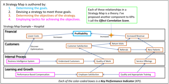
Figure 2 – The strategy map, the brain of performance management, currently is a mostly “dead” display on a performance management dashboard. Bringing it to life is the Holy Grail of BI.
Each of those little boxes maps to a KPI in the balanced scorecard shown in Figure 1. It represents a theory of enterprise strategy. The technology exists to make it not just more intuitive but to validate relationships and evolve them in tune with changing conditions and unforeseen consequences.
Understanding Strategy Maps: More than a Reporting Tool
A strategy map should serve as more than a glorified reporting tool. It represents an organization’s strategy in a concrete form, with the flow of objectives painting a clear picture of how value is created. The concept provides a shared understanding of the organization’s strategic goals and the roadmap for achieving them, offering a common language for all knowledge workers.
Strategic maps provide clarity about the organization’s strategic objectives, their connections and how they affect each other. They reflect assumptions about cause and effect, highlighting the pathways leading toward success. They’re the blueprint of the execution plan.
Yet, it’s important to remember, as Mike Tyson famously said, “Everyone has a plan until they get punched in the face.” Real-world execution of strategy is complex and often turbulent, requiring constant course correction. Therefore, the ability to evolve the strategic maps to reflect evolving reality is crucial and much more of a grind than developing the initial version.
Strategy Maps – Model of Theoretical Cause and Effect
A strategy map is a graphical representation of the relationships between the objectives of a balanced scorecard. This tool allows us to visualize the interconnected nature of objectives, enabling us to understand the “theoretical model of cause and effect” within a business organization.
As mentioned, these maps aren’t merely a performance reporting tool. They are an embodiment of an organization’s theory of success—its assumptions about cause-and-effect relationships, what’s important and how those elements interrelate. Just as every individual has a personal model of their lives in their brains, a strategy map can be seen as what I call the “Intelligence of a Business.”
The Maturity of Graph Technology
Back in the 2000s, Microsoft Visio was the best, widely accessible option for creating and viewing graphical structures like strategy maps. But even armed with VBA, it wasn’t quite ready to support a forward-thinking effort like strategy maps. Advancements since then, which include enablers such as graph databases, diagramming languages and query languages have made the creation, updating and visualization of complex data models significantly more feasible. A graph database such as Neo4j allows for efficient storage and retrieval of complex relational data, while diagramming tools like PlantUML and Mermaid provide clear, up-to-date visualizations of the strategy map. Finally, graph query languages like Gremlin and Cypher provide the means to probe and update the strategic map based on real-world performance and shifting strategic goals.
Following is a brief introduction to these graph technologies:
- Neo4j: Neo4j is a highly popular graph database management system developed by Neo Technology, Inc. It’s designed to leverage data relationships as first-class entities, making it an extremely efficient tool for managing and querying highly interconnected data. In the context of strategy maps, Neo4j can be a potent tool for storing and navigating the complex web of strategic objectives and their relationships.
- PlantUML and Mermaid: Both of these are powerful diagramming tools to create visual representations of complex information structures, perfect for constructing strategy maps. PlantUML uses a simple and intuitive language for defining diagrams, while Mermaid offers a more streamlined and modern approach with support for real-time updates, making it ideal for the dynamic nature of these maps.
- Gremlin and Cypher: These are graph query languages used for traversing and querying graph databases. Gremlin is a functional, data-flow language that allows for complex querying of graph databases, while Cypher is a declarative graph query language developed by Neo4j for expressive and efficient querying and updating of the graph store. These languages make it possible to extract insights from the complex relationships stored in a strategy map, validating objectives and updating the map in real time.
By adopting modern graph technologies like these, organizations can build dynamic, interactive strategy maps that can evolve over time, correctly reflecting changes in strategic objectives and their relationships. The maturity of graph technology is one of the fundamental components of the resurgence of strategy graphs, providing a powerful, flexible set of tools for modern organizations to effectively manage, communicate and update their strategic objectives.
Data Science and Machine Learning
Data science and machine learning have come a long way since 2010 from their earlier incarnations such as data mining and predictive analytics. Data science brings rigorous scientific methodology into the equation. It is the necessary framework to test the theories embodied in our strategy maps. We can use machine learning algorithms to test if the hypothesized cause-and-effect relationships indeed exist.
However, all theories come with a set of assumptions that require scrutiny. In our context, these assumptions outline why one strategic objective leads to another. For example, why would employee training lead to employee satisfaction and on to improved productivity? What are the underlying reasons behind this supposition? Within a scientific framework, these assumptions are stated explicitly and tested.
The value in stating our assumptions is that we sanity-check any disconnect between what we think and hope will happen versus what actually happens. It is important to be mindful of the potential for gaming KPIs, where individuals manipulate their activity to meet targets without consideration for how the actions affect the system as a whole. For example, a sales manager might aggressively pursue sales with drastic discounts and future promises to meet KPIs – oblivious to how such actions may inadvertently create inventory management problems, leading to shipment delays and customer dissatisfaction.
Machine learning can be used to set various KPI components. For example, it can set optimal thresholds for KPI targets taking into account the unintended consequences of such actions. If our strategy involves raising fees, we risk losing customers. But higher fees might be justified by the quality of offering and could lead to further improvements. Machine learning can help us predict how many customers we will lose at various levels of fee increases, adding a new dimension to our strategy map.
Harnessing AI for an Evolving Strategy Map
The maturation of artificial intelligence (AI) is the last of the three major technologies that pave the way for the development and utility of strategy maps. AI’s involvement can significantly relieve the burden on a very large, enterprise-spanning, cross-functional team in the quest for the truth about how an enterprise’s ecosystem really works.
Given the assumptions we make about relationships between strategic objectives, AI can provide feedback on the legitimacy of these assumptions, suggest ways to test them and recommend course corrections. AI may not be truly “intelligent”, but its integrated “knowledge” spans a scope of humanity far beyond what any of us can juggle in our brains.
AI can delve deep into the cause-and-effect relationships we theorize in strategy maps. By analyzing historical and real-time data, AI can identify patterns that support or contradict our assumptions. It can also propose new cause-and-effect relationships that may not have been previously considered, adding an extra dimension to the strategy map.
When it comes to key performance indicators (KPIs) and their formulas for value, trend, status and target, AI can provide invaluable insights. It can suggest optimal KPIs, aid in formulating them and offer feedback on their relevance and effectiveness in tracking progress toward strategic goals.
Disconnect Between What We Think We Know and How Things Really Are
One remarkable capability of mature AI is its ability to write code in many different languages (SQL, Cypher, Gremlin) and formats (JSON, CSV). In the context of strategy maps, this could mean the automatic generation of scripts for various tasks such as data extraction, visualization, correlation analysis, or even real-time updating of the strategy map itself. This function greatly simplifies the otherwise complex and time-consuming process, making these maps more accessible and easier to manage.
However, while AI provides immense support in creating and managing strategic graphs, the process should still fundamentally be human-driven. The nuances and complexities in the operational landscape can often be perceived and understood only by humans. For instance, the details of on-the-ground operations, worker experiences and practical challenges often escape AI’s radar.
Involving those who actually perform the work in the planning activities is crucial. Techniques such as event storming, which brings together diverse stakeholders for intensive, collaborative exploration of business processes, can provide rich, practical insights. These human insights, when combined with AI’s analytical prowess and wide scope of knowledge, create a dynamic, responsive and realistic strategy map that accurately reflects the organization’s strategic vision, while remaining adaptable to changing realities.
The Effect Correlation Score
An intriguing part of this reimagined strategy map is the inclusion of what I’ve coined the Effect Correlation Score. This score, an additional KPI component, measures the correlation (ex. Pearson Correlation) of the KPI statuses between two objectives over time. This serves to validate whether the hypothesized cause-and-effect relationship between objectives is actually observed and measured.
The Effect Correlation Score works by continuously logging and analyzing the status component of related KPIs. If the correlation between these statuses remains strong over time, it indicates that the relationship is valid and the cause-and-effect logic holds. However, if this correlation weakens or becomes erratic, it suggests something in the system has changed and the hypothesized relationship might not work as initially theorized.
With advanced data science and AI capabilities, the computation and tracking of Effect Correlation Scores have become increasingly feasible and insightful. Machine learning algorithms can calculate these scores accurately and efficiently, making it possible to continually validate and update the strategy map in real time. This allows the organization to stay adaptive and responsive to changing conditions.
For example, let’s consider an objective to improve employee training, hypothesized to lead to increased employee satisfaction. The Effect Correlation Score would analyze the KPIs related to these objectives, such as the number of training programs attended and employee satisfaction ratings. A strong and consistent correlation between these KPI statuses over time would validate the cause-and-effect assumption that improved training leads to increased satisfaction.
AI’s maturity could provide another layer of depth by offering insights into why Effect Correlation Scores might not reflect the theoretical cause-and-effect relationships in our strategy map. For instance, it could help identify that a recent change in the work environment, or external factors like market conditions, might be influencing employee satisfaction levels, leading to a reduced correlation with training programs.
The Effect Correlation Scores introduce a systematic, data-driven approach to validating the cause-and-effect assumptions in a strategy map. Combined with advanced AI, machine learning and graph technology, they can help create dynamic maps that accurately reflect an organization’s strategy while continually adapting to changes. This fusion provides an exciting direction for the future of corporate analytics and performance management.
Conclusion
The potential of strategy maps has become significantly more feasible since their introduction in the early 2000s and even since 2010, when I wrote Bridging Predictive Analytics and Performance Management. Today, equipped with the comparatively matured capabilities of AI, data science and graph technology, these maps should serve as the centerpiece of enterprise analytics. Those capabilities provide invaluable capabilities for authoring, testing, validating and continually evolving an organization’s strategic plan. To me, it is the Holy Grail of corporate analytics.