
What this blog covers:
- An introduction to Insight Space Graphs and how they facilitate making superiorly informed, data-driven decisions.
- The role of ISG in an Enterprise Knowledge Graph (EKG), and how it adds value by linking to broad semantics.
- Fundamental of an ISG and three use cases that illustrate how the ISG can add significant value to BI operations.
As enterprises progress in their journey towards data-driven excellence, accelerated by the ready availability of AI, the demand on business intelligence (BI) systems is set to continue to escalate significantly. The struggle of BI systems to keep up with increasing demand will be a major roadblock. This increased burden arises from the combination of the:
- Resultant growth in the number of information workers that depend on data.
- Resultant growth in the number of data sources.
- Increase in the sophistication of queries.
- Addition of AI itself as a massive hyper-consumer of BI data.
These factors will mix in unpredictable ways leading to unpredictable levels of pressure on BI demand.
The subject of this article is the amelioration of two interrelated pressures on BI demand – scalability to meet the query demand and reigning in the complexity of a widening breadth of data. Figure 1 illustrates the dilemma we face and the resolution towards the quest to make better decisions for the enterprise.
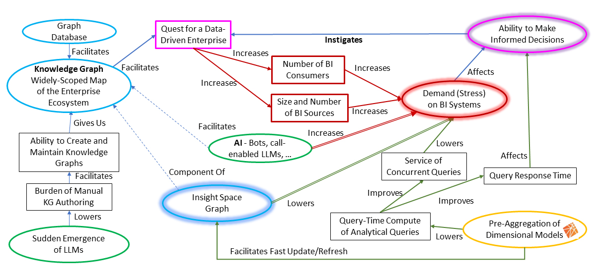
Figure 1 Causal model illustrating the dilemma we’re facing (2)
At the top-right corner is our ultimate goal and primary strategy: strive towards making superiorly informed, data-driven decisions. The other factors—graph database, the sudden emergence of LLMs (Large Language Model), AI, Insight Space Graph (the solution) and pre-aggregation of dimensional models—intertwine towards a solution to the unwanted side-effect, the demand on BI. We can also see that what I call the Insight Space Graph (ISG) is at the center of it all.
Background Topics
This is Part 1 of a multi-part series covering the ISG. This is an introduction to cover how the pieces depicted in Figure 1 fit together. Before getting to the ISG itself, I need to briefly cover necessary background topics, along with the primary things it brings to the table, that tie together at the ISG. The topics roughly map to the oval items in Figure 1.
Pre-Aggregation of Dimensional Models
Over two decades ago, pre-aggregated OLAP cube technology—most notably, SQL Server Analysis Services (SSAS)—addressed the scalability of BI queries which until then was severely hampered by redundant query-time computation of large volumes of data. By focusing on the fundamental analytics pattern of slice-and-dice queries, SSAS could pre-aggregate those large volumes of data, which drastically reduces query-time compute. For almost a decade, from roughly around 1999 till 2008, SSAS and other pre-aggregate OLAP solutions were almost synonymous with BI.
However, various factors pushed BI demand beyond what a single, top-end server or “scale-up” could handle. Then came the invasion of the “scale-out” technologies. It started with Hadoop and the breakout of massively parallel processing (MPP) data warehouses. Then on to Spark. The massive scalability of the cloud is the enabler of the last decade that shifted analytics into 2nd gear towards success in data-driven aspirations.
OLAP cubes took a back seat during this past decade of big data and the cloud. However, the sheer volume of analytical data, driven by the sudden emergence of readily accessible and high-quality AI, will again necessitate a revisiting of this optimization technique manifested in pre-aggregated OLAP cube technology, but now in a cloud-scale version. It will shift data-driven aspirations not just to the 3rd gear, but maybe even the 4th or 5th!
Over the past few years, on the subject of slow analytical queries, an IT manager weighs bringing in yet another product (and all that implies) versus making do with “advanced features” in products already available to her. It’s OK to live with the bulk of queries taking a few seconds versus less than a second and an occasional one that take a minute or more.
However, at such a sudden volume increase, the virtues of pre-aggregated OLAP will shoot beyond the “good enough” options for data warehouse (DW) acceleration that are available in current data warehouse platforms (Lakehouses, Snowflake). Examples of built-in, good-enough options include:
- Materialized views – Require manual maintenance.
- “Build as you go” aggregations – Inconsistent performance as aggregations are created as needed./li>
- In-memory OLAP databases – Requires up-front loading and limited to the memory of the server. /li>
However, for the magnitude of demand on BI sources, I predict OLAP cube technology alone will not be enough. There will be a need for an even further layer of acceleration.
AI (Bots, Call-Enabled LLMs) – Just Like Human BI Consumers, Only More Intense
A resolution-seeking AI will pretty much ask the same questions asked by human analysts. After all, in theory, AI serves our human needs, working on the same problems in the same world we all live in.
Therefore, in the context of business intelligence, an AI tasked with finding innovative ways to improve a business would usually go through the same procedure as a person:
- Identify the problem to be solved, or ‘where are we going’.
- Fully digest what success looks like.
- Obtain a full understanding of ‘where we are’.
- Investigate possible paths from ‘where we are’ to ‘where we wish to be’.
- Elucidate a strategy based on a selected plan, including an understanding of risks and contingencies.
AI isn’t just another BI user. AI will drastically exacerbate the pummeling of BI data sources far beyond the most motivated and smart data scientists. For example, “analysis time” is the expected timeframe between a cycle of query, to result, to thinking and back to querying. For a human, the activity of analyzing, or the “speed of thought”, would be in the order of seconds – seconds to think and formulate a follow-up, seconds to get results of a follow-up query. That’s the analyst sitting with Tableau slicing and dicing through some BI data source.
An AI is doing the same thing, but it usually will not require seconds to think of follow-ups nor does it necessitate a visualization tool. Analysis time for an AI can be within milliseconds, and it can be highly parallel with more than one AI, each exploring multiple paths simultaneously. Analysis Time for an AI is far beyond one to a few concurrent queries taking a minute versus less than a second. It’s now a matter of a large number of concurrent queries.
Enterprise Knowledge Graphs and LLMs
Enterprise Knowledge Graphs (EKG) are a centralized repository of relationships across an enterprise and beyond its walls. EKGs have been recognized as profoundly valuable for at least a decade. But it’s only been with the sudden emergence of readily accessible AI for the layperson that EKGs are now feasible to create and maintain.
At the time of this writing, EKGs are primarily demonstrated using two major components, collectively called a Semantic Layer:
- The semantic relationships of objects. It holds relationships (“is a”, “a kind of”, “has a”, etc.) ranging from “Kyvos is a company”, to ”Kyvos is an OLAP database” and “OLAP databases store pre-aggregated data”.
- An enterprise-wide metadata data catalog of all the data sources, databases, tables, columns, the relationships between columns and even some sample values.
The ISG is what I propose as another major component of a EKG. It is the “knowledge” of what has been discovered over the course of BI activity in the enterprise, captured in a graph. It is the captured insights that BI analysts look for as they access OLAP data sources though visualization tools such as Power BI and Tableau. As another example of “components of a EKG”, I’ve recently written about a component called the strategy map, from the performance management world: Revisiting Strategy Maps: Bridging Graph Technology, Machine Learning and AI
Kyvos AI-Based Smart Aggregation + Graph Database
OLAP cubes are among the most rigid structures in analytics. It’s the primary trade-off for the ability to methodically produce “create-once/user-many-times” aggregations in return for extreme query acceleration. Although the power of pre-aggregated OLAP is mostly limited to additive measures, summation is the single most important function. The majority of questions asked by managers and analysts are some variation of “What is the total [sum of] sales in CA for high-end products over the last three Octobers?” That’s why the Σ is so prevalent in math equations.
On the other end of the spectrum, graph databases are the among the most flexible structures, able to accommodate a wide range of evolving properties and relationships inherent in the real world. Graph databases are optimized for the storage and retrieval of triplets of information—subject-predicate-object, like the first item of the semantic layer above.
Both technologies are so fundamental that almost all developers on relational database engines such as SQL Server and Oracle have re-invented both pre-aggregation and the open schema (or key/value pair) of graph databases.
Often, teaming the best-of-breed from extremes—for example, Kyvos SmartOLAPTM and Neo4j—and letting each side independently do what it does best, is more powerful than combining the extremes into a single product rife with middle-of-the-road compromises. Together, pre-aggregated OLAP cubes and graph databases offer the best of both worlds.
Figure 2 illustrates OLAP cubes on one side and Graph databases on the other. Between them, the ubiquitous Python is the intermediary, leaving the heavy lifting to the two best-of-breeds. Additionally, as Python is relatively user-friendly (for a full-featured programming language), it handles aspects requiring versatility beyond the out-of-the-box capabilities of OLAP and graph technologies.
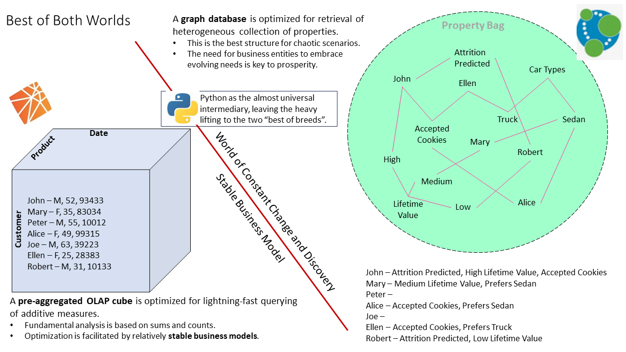
Figure 2 – The best of two extremes.
I should mention that it is somewhat possible to house an ISG completely in one product or the other. But either product will be lacking in functionality or performance from its counterpart.
The Insight Space Graph
The ISG captures, stores and shares salient points—the insights—from datasets generated during the course of “normal” BI efforts by human analysts. These insights are a record of what is important to analysts across an enterprise, often providing clues to their intent. The ISG could be a stand-alone large-scale graph, but it is best embedded in a wider-scoped EKG where it can link to broad semantics, thereby enriching the EKG with the semantics of what is going on in the enterprise.
Information Worker Theory of Mind
Most of the rich and deep knowledge of an enterprise—the richly woven rules of business, as opposed to simple IF-THEN-ELSE—has always been distributed and siloed in the heads of human employees. Unfortunately, due to the nature of our intelligence and biology, we aren’t as fast and thorough at human-to-human communication as computers are at machine-to-machine communication. Hence, we only notice and communicate a small fraction of information to a small fraction of people. Therefore, most of what we know is trapped in our heads.
Over the years, techniques and technology have softened those silo walls in ways ranging from apprenticeship and cross-training to rules encoded in our developed software and specific formats such as UML. However, these artifacts require tremendous human effort to maintain – to the point where it’s often more trouble than it’s worth in the midst of immediately pressing matters. So, whatever documented knowledge we do manage to develop, grows more and more distant from how things actually work if left unmaintained.
If we are working through a problem, we either need to rediscover insights or figure out who among thousands of co-workers might have that information. But we don’t know what we don’t know. How often is it that people stumble across bits of information of no use to them, but they don’t know are of value to another? So, that seemingly novel ‘aha!’ moment isn’t recorded for someone else to easily find on some database.
To address this, the idea of the ISG is to unobtrusively tackle the issue of exploding demand on BI systems by capturing some level of intent from the growing clientele of those BI systems.
Insights
The ISG “remembers” what is or was important to users across various roles through their BI queries. The vast majority of queries by human users are visualized in a few very familiar visualizations. For each of these visualizations, there are a relatively small set of qualities that comprise the vast majority of insights analysts might be looking for. Some of those insights might to useful to the user, some are not useful and others just go unnoticed.
Unless the dataset is very large, like millions of rows, the recognition of those insights is not computationally intense. Therefore, for each query used to produce those visualizations, we can comfortably wring out all the information – whether useful, useless, or unnoticed to the user. It may not be of value to the analyst who pulled up the visualization, but it might be of value to any of the thousands of other information workers in the enterprise.
I refer to the thorough extraction of insights from a dataset as wringing the dataset. Following are the very familiar visualizations and a sampling of some of those insights:
- Bar Charts: Measure values by members.
- Largest member, oligopoly of dominant members.
- How long of a tail, or how thick.
- Gini coefficient, the measure of the equitable distribution of a measure.
- Dominant members and outliers.
- Line Graphs: Patterns over time.
- Trending up/down, linear regression.
- Erratic behavior, or variance.
- Periodic cycles, Fourier.
- Elbow curve, when do things skyrocket?
- Correlated lines, for multiple time series.
- Scatter plots: A makeshift clustering of members.
- Outlier values, seem to be the oddball that doesn’t fit into any cluster.
- Stacked Bar Chart: Composition of members by some dicing attributes
Before moving on, I’d like to address very large datasets I mentioned earlier. A very large resultant dataset of millions of rows is usually impractical to visualize by a person. OLAP queries typically aggregate a massive number of rows to higher levels such that the number of rows returned is typically a few to a few hundred. Millions to trillions of rows of data are computed into a small, distilled, humanly-digestible number of rows. A very large resultant dataset of millions of rows is usually impractical to visualize by a person anyway.
A large dataset with millions to trillions of rows would more likely be directly used by data scientists to create ML models, which usually requires data at a low granularity. ML models could be thought of as a more complicated aggregation than the summations native to pre-aggregated OLAP.
Insight Space
Insight Space is all the possible insights we could pluck out from all possible datasets that could be generated from the collection of BI data sources. The ISG is a map of discovered insights within insight space. As it is with any explorer on a quest for something, a map provides hints and clues laid down by previous explorers, on which they will build their own new discoveries made on subsequent explorations.
Figure 3 illustrates the stack of spaces. At the bottom is the physical world where events involving things actually happen. A subset of those things and events are captured into the data space in a rapidly growing arsenal of enterprise data stores.
The cube Space (collection of cubes) forms the “semantic layer” mentioned earlier. It is the friendly interface between the messy databases and the human users. The cubes of the cube space are abstractions of data across one or a few databases into a business-problem-oriented dimensional model, a data format easy for BI consumers to understand.
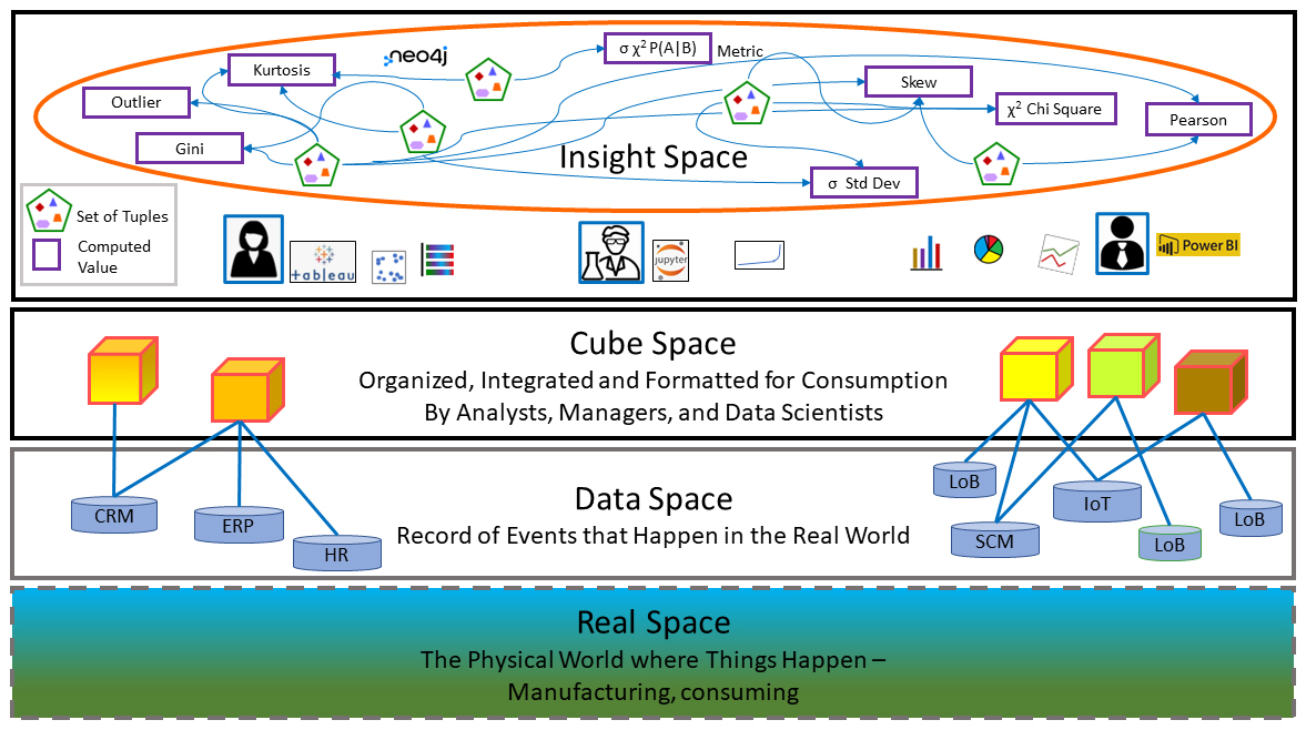
Figure 3 The space stack starting from the ultra-complex real world at the bottom.
Driven by the need to resolve business problems, through sophisticated BI tools such as Tableau and Power BI, human BI consumers explore the cube space. Portions of the cube space are plucked and transformed into visualizations (ex. line graphs, bar charts, scatterplots, pie charts).
Embedded within these visualizations are insights. As mentioned a few times, due to the sheer volume of information, most potentially valuable insights can go unnoticed by analysts or shared to relatively few. Some are noticed and maybe noted in some sort of record, some go unnoticed. But like a tireless astronomer charting every object in space that crosses her field of vision, a process automatically calculates and stores an arsenal of insights for each yet unmapped query it encounters.
Across a successfully data-driven enterprise, there could be thousands of analysts interrogating data from hundreds of data sources. As enterprises strive towards being data-driven, the number of analysts will significantly grow. The combinations of business problem elements, data sources and the thought processes of individual human analysts result in massive combinations of queries, stressing BI sources.
Caching Three Levels of Systematic Computation
The ISG only holds salient points – insights. Although the datasets from which salient points are extracted are themselves usually “compressed” versions of massive volumes of underlying data (aggregations of DW data), the datasets are still usually substantial in size compared to a dozen or two salient points wrung from the dataset.
Similar to how after squeezing all the juice out of a lemon, we can discard the skin and pulp, we can discard the dataset. Should we want to look at something that we didn’t wring out of the dataset, we can regenerate it from the OLAP cube many times faster than we could from the underlying data warehouse (DW).
Through the schema of the ISG, the lineage of data sources of the salient points is traceable to the very query from which it’s derived, and the data sources that were queried. Should we require data from the DW that isn’t in any OLAP cube, we can drill through to the underlying DW.
Those are the three levels of compute caching as numbered in Figure 4. Why redundantly re-compute for portion a of cube space that doesn’t change? Compute incurs costs for the time waiting for results and money for the re-compute.
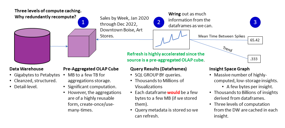
Figure 4 Three levels of systematic caching to handle the AI-exacerbated level of demand on BI systems.
If we didn’t capture the insights, but perhaps cached the datasets (2), we wouldn’t have access to the semantics of the insight and quickly search by it. For example, if we asked an LLM, “Could you find any instance of a dominant store in an area? The LLM would understand that a Gini coefficient might be a metric to look for. It could look for tuples related to a high Gini coefficient. If we didn’t cache insights for Gini coefficients, it would need to search through all the datasets, performing that calculation at query time on each dataset.
Figure 5 is a depiction of that process of a human user performing BI (yellow lines, with circles) and/or querying the ISG (red lines, with triangles). In this case, the querying is from a notebook since the user can query both from a notebook given the current state of BI tools.
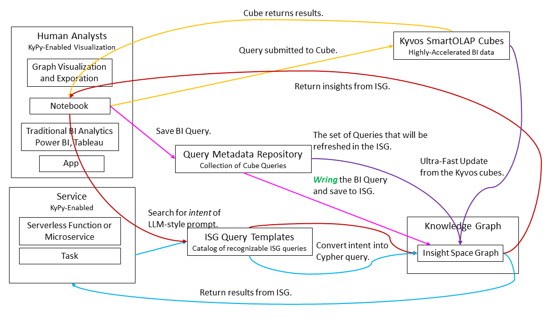
Figure 5 Query flow of the ISG through a notebook (Jupyter or Databricks) and how it’s updated.
The processes are color-coded:
- The yellow lines (with circles) trace the traditional BI OLAP query pattern.
- A query is executed from the notebook to an OLAP cube.
- The cube returns a dataset to the notebook.
- The red lines (with triangles)trace queries to the ISG.
- An LLM prompt style of query is executed from the notebook.
- The LLM prompt is matched with the ISG Query Template most matching the intent of the LLM prompt.
- The query is issued to the ISG.
- The ISG returns a result to the notebook.
- The blue (with diamonds) traces an ISG queries from a service. The process is the same as for the red line just above – only the caller is a service.
- The purple (with stars) and magenta (with squares) lines represent updating the ISG. There are two paths:
- Magenta: Update the ISG with a query made by a human user. The notebook passes the query metadata (a kypy object) and the resultant dataset. The query metadata is added to the Query Metadata Repository. Note that we only save the metadata, not the actual dataset
- Purple: The other path (from the Kyvos cube directly to the ISG) depicts refreshing of existing parts of the ISG. Parts of the ISG may require refreshing. This is actually one of the prime selling points – that we can refresh very quickly from underlying OLAP cubes.
Fundamental of an Insight Space Graph
In this time where mindshare is dominated by probabilistic LLMs and ML models, it’s worth noting that the data comprising the ISG is factual and highly curated data which is distilled from cleansed and factual databases. By partitioning the data gleaned from BI users as a component within the wider-scoped EKG, which can contain subjective data from human experts or an AI, the ISG creates a safe zone of deterministic values.
Figure 6 illustrates the top-level schema of the ISG. The schema is a framework that captures the essence of the bread and butter, slice and dice type of query of traditional BI activity. Capturing this dominant BI pattern—which is like a SQL GROUP BY—with this schema mitigates the complexity of the ISG.
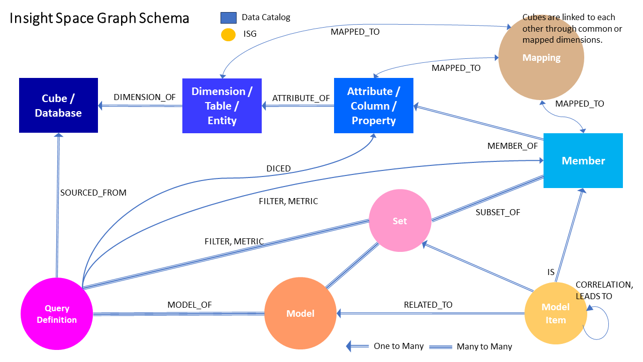
Figure 6 Insight Space Graph Top-level Schema
The ISG is linked to the wider-scoped EKG firstly through the data catalog nodes – database, table, column and member. Secondly, the “Mapping” node at the top-right maps similar tables (entities concept), columns (properties concept) and members (actual “things”). These mappings are authored by subject matter experts and/or inferred by AI.
Figure 7 is an example of the insights wrung (more on this word soon) from a query and written to the ISG. In this case, the insights include a set of standard statistics (highlighted node), Gini coefficients and outliers for each metric (volume, bottles sold and sales).
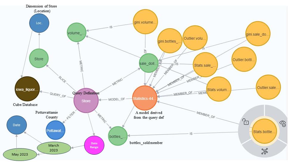
Figure 7- Example of nodes comprising a Query Definition.
Note the start and end dates towards the bottom left. This indicates that insights cached in the ISG represent a very specific timeframe. This means that “updating” with the latest data would mean either adding a tuple with a different date range or refreshing the tuple because the underlying data for that date range has been modified.
Figure 8 dives deeper into the details of the query. On the left is the SQL query from which the query all the objects shown in Figure 7 above were created.
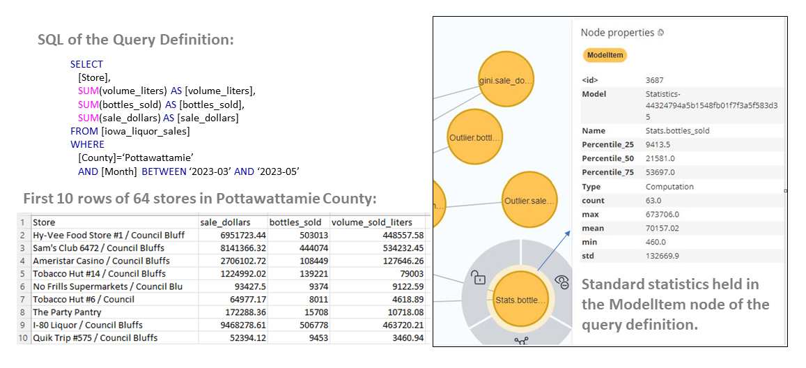
Figure 8 – SQL that sourced the graph shown in Figure 4 above, along with details of standard statistics.
On the right are details for one of the metrics, the standard statistics for the bottles sold. In the case of the standard statistics, they are laid out as a single node with multiple properties.
Of course, this is a very brief overview conveying the general idea of designing an ISG. A deeper dive will be part of subsequent articles in this series.
Use Cases for the Insight Space Graph
The Insight Space Graph (ISG) certainly presents a wide range of potential use cases. In addition to caching computed values and connecting dots for more intuitive data mapping, the ISG can significantly enhance business insights, decision-making, and overall user experience in BI. Here are three profound use case summaries:
- Enhanced Data Analysis: The ISG can capture and record critical insights identified during routine BI activities. Not just the expected outcomes, but the unexpected discoveries as well. This not only simplifies the data analysis process, but also deepens the depth of understanding, enabling users to draw more accurate, comprehensive and valuable conclusions.
- Contextual Information Delivery: When a BI user is exploring a dataset, the ISG can supply additional contextual information linked to the data points being examined. Much like how search engines provide related information on a searched topic, the ISG can enrich the user’s analysis by delivering relevant, valuable and potentially enlightening insights that may not have been initially sought.
- Guided Exploration of Aggregated Data: Aggregated data can often conceal intriguing patterns and relationships. Manual exploration can be time-consuming and less than optimal. With the ISG, it becomes possible to guide users towards meaningful drill-downs or drill-ups, highlighting fascinating patterns and interconnections. This enables a more in-depth and informed exploration of aggregated data, revealing potentially significant insights that might otherwise remain obscured.
Conclusion
As we strive towards achieving true data-driven excellence, BI systems are grappling with the escalating demand for data, a demand that arises from an ever-increasing number of information workers, diverse data sources, sophisticated queries and AI’s insatiable hunger for data.
However, this challenge could also be viewed as an opportunity for innovation. The Insight Space Graph (ISG) is a promising proposition to ameliorate these pressures, by capturing, storing and sharing salient insights from datasets generated during routine BI activities. By pairing the best of pre-aggregated OLAP cube technology and graph databases, the ISG offers a powerful, scalable and flexible solution that promises to revolutionize how we navigate and interpret BI data.
Moreover, by integrating the ISG into the broader enterprise knowledge graphs, businesses can gain a comprehensive view of their operations and enrich their data interpretation capabilities. This integrative and holistic approach to BI can allow enterprises to harness the full potential of their data, thereby facilitating the making of superiorly informed decisions, which is the ultimate goal of any data-driven enterprise.
This article is an introduction to the Insight Space Graph. It is just the kickoff in a series. As we proceed in this series, we will delve deeper into the inner workings, practical applications and potential of the ISG. Part 2 will cover how Kyvos’ AI-based Smart Aggregation technology plays a key part in the fruition of the ISG. Additionally, I’ll introduce a framework I developed that ties the pieces together. I lightly touched on it in Figure 2. It is a Python library for Kyvos I developed named kypy.
For detail into the background of the Insight Space Graph, please see my previous blog, Insight Space Graph.